Collapsible Table module

Last week I was given the task to create a collapsible datatable, which confronted me with some oddities in the dom which I wasn’t aware of.

Get the example at github-collapsible-table

I had given myself the following requirements

  • The code needs to be extensible
  • The table should be just a table, no extra markup
  • It should be easy to rewrite the table for a framework
  • Keep it simple
  • No jQuery

simple collapsible table

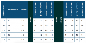
Vertical table headers

My first attempt was css transforms, easy to adjust and to implement. However the problem was that I needed extra markup to keep the header in the normal page flow. After some consideration is seemed to me that SVG is the best option, it is scriptable, stylable and it maintains the normal paqe flow. See the snippet below

<th>
  <svg xmlns="http://www.w3.org/2000/svg" width="16" height="150">
    <text text-anchor="end" transform="rotate(90, 12, 0) translate(160,10)">Vertical header
    </text>
  </svg>
</th>

cellIndex to the rescue

I needed to have a proper way to get track of the current clicked cell and it column index. Luckily JavaScript provides a native property element.cellIndex.

Rowspan messing up

One thing to notice is that each subsequent rowspan decreases the cellIndex by one. This needs to be compensated for, in the main script loop. The script loops through all the toggle elements and creates an array with their corresponding cellIndexes. On toggle click these cellIndexes are used to get the cells between two toggle elements and push them into an array. This array can be used to manipulate the cells ( hide/ show ).

Disadvantages

Since each cell is manipulated independently it is not possible to create an block animation. If that is a requirement than markup should be added to create containers for the cells.

Less Breakpoints

The web is getting more diverse and websites needs to be more adaptable than ever. In my opinion it is necessary to reduce breakpoints and let the content decide and define the layout of webpages.

I created a very simple fluid layout, with new css technologies, just to see if a fluid page is already feasible in modern browsers. I have used flexbox, vw units en css variables.

fuid-layout

CSS Variables

See the example below the :root pseudo selector is an analogy to the global scope in JavaScript. You could also for example scope the variables to a “.module” class name.

:root {
    --main-color: #EFECCA;
    --accent-color: #A7A37E;
    --accent-color-middle: #E6E2AF;
    --title-color: #002F2F;
    --interactive-color: #046380;
    --text-color: #696969;
}

One breakpoint…

Still one breakpoint left, at first relative units and flexbox did the trick. One breakpoint for better mobile view and more readable font-sizes on small screens is still included.

fluid-mobile

Conclusion and concerns.

I still have my concerns for a full blown webpage. There will always be third party content, like adds and other embedded content which will not stretch easy. However it is perfectly possible to create a pleasing layout with very little and mainable CSS. I even found it pleasant to be working with plain CSS afters years of .less and .scss. I predict a comeback for CSS with CSS-variable, flexbox and CSS gridlayout arround the corner. And with HTTP2 and modern bundlers like Webpack the need for css compilers might diminish in the future.

You can get the code at https://github.com/jeroenoliemans/wonderolie/tree/master/LessBreakpoints for further experimentation, I only tested it in Chrome 49 and beyond.