Less Breakpoints

The web is getting more diverse and websites needs to be more adaptable than ever. In my opinion it is necessary to reduce breakpoints and let the content decide and define the layout of webpages.

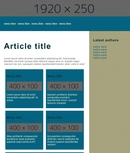
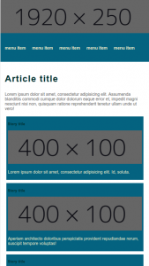
I created a very simple fluid layout, with new css technologies, just to see if a fluid page is already feasible in modern browsers. I have used flexbox, vw units en css variables.

fuid-layout

CSS Variables

See the example below the :root pseudo selector is an analogy to the global scope in JavaScript. You could also for example scope the variables to a “.module” class name.

:root {
    --main-color: #EFECCA;
    --accent-color: #A7A37E;
    --accent-color-middle: #E6E2AF;
    --title-color: #002F2F;
    --interactive-color: #046380;
    --text-color: #696969;
}

One breakpoint…

Still one breakpoint left, at first relative units and flexbox did the trick. One breakpoint for better mobile view and more readable font-sizes on small screens is still included.

fluid-mobile

Conclusion and concerns.

I still have my concerns for a full blown webpage. There will always be third party content, like adds and other embedded content which will not stretch easy. However it is perfectly possible to create a pleasing layout with very little and mainable CSS. I even found it pleasant to be working with plain CSS afters years of .less and .scss. I predict a comeback for CSS with CSS-variable, flexbox and CSS gridlayout arround the corner. And with HTTP2 and modern bundlers like Webpack the need for css compilers might diminish in the future.

You can get the code at https://github.com/jeroenoliemans/wonderolie/tree/master/LessBreakpoints for further experimentation, I only tested it in Chrome 49 and beyond.

SVG viewbox, make stretchable graphics

Get the source at Github

I struggled with SVG, creating an early protoype of a mobile webapp. I wanted to create an interesting background for the webapp. It needs to be resolution independent and scalable without quality loss, SVG seems the best choice because of the vectors.

My initial thought was to make a 9-slice attempt for SVG. However since the app should be used with a phone in portrait orientation and I felt that repeating parts of the background would not be sufficient for final app. Therefore stretching should be full isze and strechable.

Steps

First I created an illustrator file with the symbol sprayer to create a framelike graphic, I exported it as svg with the default setting with “Save for web”. You can see the example below.

Background in illustrator for SVG export

Secondly make sure the svg element has the folowing style:

	position: absolute;
	width: 100%;
	height: 100%;

The trick is to make sure that the width and height of the input SVG in pixels matches the width and height of the viewbox, and that the start corner matches you desired result. Viewing the examples makes it more clear.

Examples

example : desired results

SVG properties

As you can see Illustrator defaults the viewbox as desired. Is moves the mask (viewbox) to the position 166.646, 114.09 of the dimension of the available vector art in the drawing.

	 x="0px" 
	 y="0px" 
	 width="100%" 
	 height="100%" 
	 viewBox="166.646 114.09 720 1280"
	 preserveAspectRatio="none"
	 meetOrSlice="slice"

example : undesired result now it shows all the artwork

SVG properties

In this example the viewbox contains all the available vectors in the illustrator file.

	 x="0px" 
	 y="0px" 
	 width="100%" 
	 height="100%" 
	 viewBox="0 0 994 1517"
	 preserveAspectRatio="none"
	 meetOrSlice="slice"

Code

The examples and the illustrator file can be downloaded from Github